Red — energy, power and emotion
Red doesn’t ask for attention — it demands it. It’s the colour of passion, blood and energy – the most primal instincts that brands have used for over a century to stop, activate and attract people. It’s a colour that simply cannot be ignored.
Meaning and impact
Red is the only colour with a scientifically proven physiological effect: it increases heart rate and blood pressure. The human body reacts to red automatically, sending a signal for action, reaction and survival.
Culturally, red has endless layers. In the West, it symbolises energy, passion and courage – but also carries opposing emotions such as danger and prohibition. In Asia, it represents luck and prosperity, while in India it symbolises holiness and endurance. In politics, red has stood for both revolution and power; in religion, for sacrifice and sacredness.
In branding, red is never neutral. It always has a purpose – to awaken, to shake, to move.
Everyday brands powered by red
No other colour dominates consumer branding quite like red.

Coca-Cola Red (#F11006)
Coca-Cola built its identity around a bright, warm red that has become a global symbol of optimism. We explored its colour and logo story in our article Famous Logos VIII — Coca-Cola.
LEGO uses the same colour but with an entirely different energy – playfulness, creativity and childlike confidence. Read more in Famous Logos XIV — LEGO.
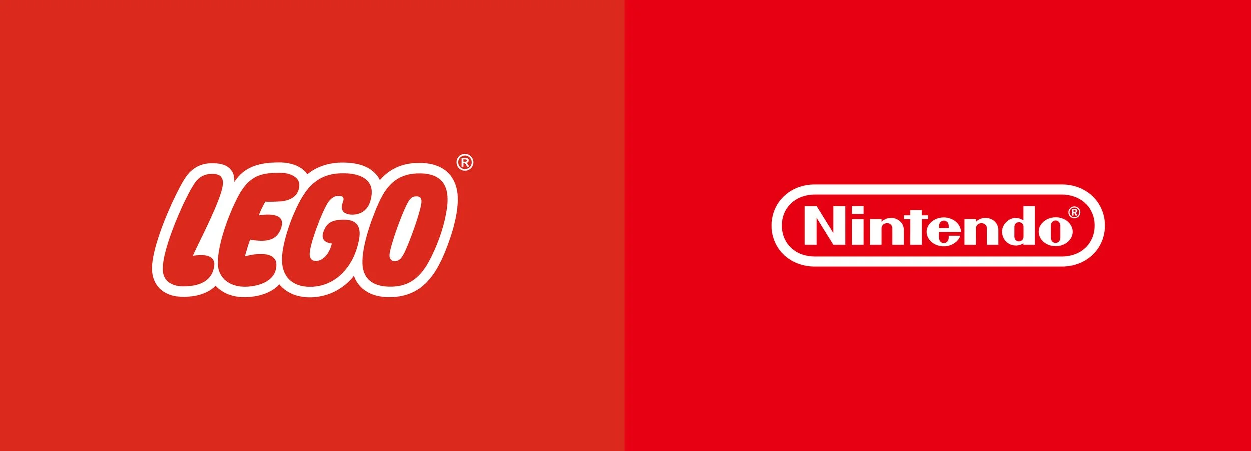
LEGO Red (#DA291C), Nintendo Red (#E60012)
Pepsi uses a red-and-blue combination that balances energy with reliability. YouTube has brought red into the digital era – the colour of a click, a pulse, an impulse. Netflix, on the other hand, has proven that red can be cinematic and luxurious – an intensity that’s become part of the experience. See also our article on blue and how brands use it globally – Blue – why this colour is the most trusted choice in branding.

Netflix Red (#D81F26), Youtube Red (#FF0033)
Automotive, sport and adrenaline
In the automotive world, red translates directly into speed and power. Ferrari, Toyota, Mitsubishi and Tesla all use red to emphasise motion and strength. In sports branding, red is the colour of emotion and drive – Puma and Under Armour use it as an energy spark rather than a decoration.
Red doesn’t create calm – it creates movement. And that’s what makes it ideal for brands that want to be remembered in moments when the pulse is high and decisions are fast.
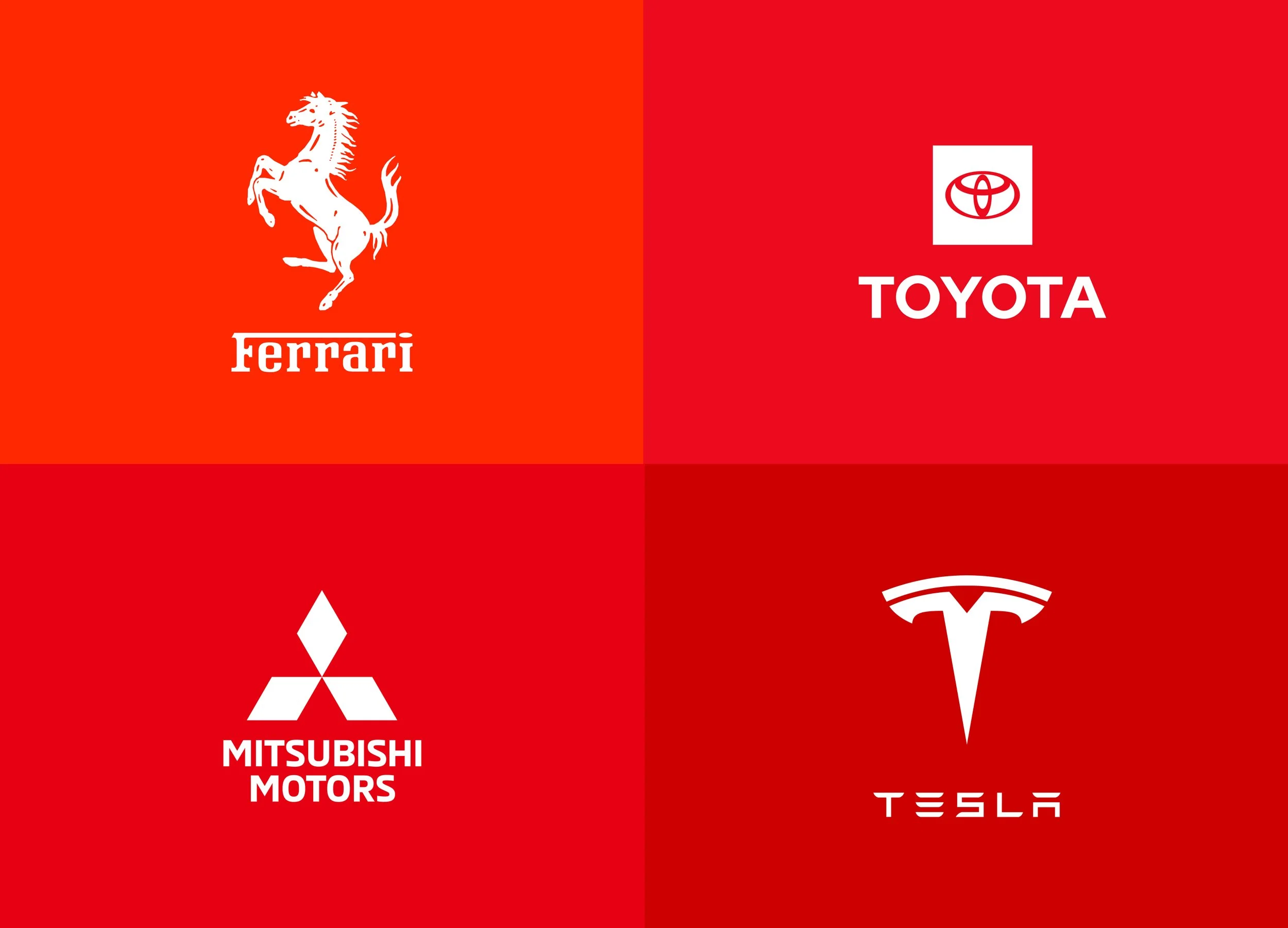
Ferrari Red (#FF2800), Toyota Red (#EB0A1E), Mitsubishi Red (#E60012), Tesla Red (#CC0000)

Puma Red (#BA2026), Under Armour Red (#972234)
Technology and the digital world
If blue is safe and professional, red is the risk-taker of the digital world. Adobe is a classic example – a union of creativity and energy that sets it apart from colder, more corporate competitors.
The same goes for Canon and Nintendo, whose warmer red tone brings a human touch to technology. We explored Nintendo’s story and the role of red in its identity in Famous Logos IX — Nintendo.

Adobe Red (#ED2224), Canon Red (#CC0000)
Red in tech means: “We are not neutral.”
Lessons for brands
Red must be used wisely. Too much, and it dominates; too little, and the effect disappears. The best brands know how to dose it: Coca-Cola’s red works with white and glass textures; Netflix balances it with black; LEGO lets red play with yellow and white.
Red is like sound – powerful only when there’s space around it.
Key takeaway
Red is the most emotional colour in design – a reaction, not a thought. It combines energy, risk and feeling, making it the driving force of the branding world. It can be an impulse or a symbol, but it’s always a statement.
That’s why red never disappears – it just changes rhythm.