Why typography matters in visual identity?
Typography is more than just letters on a page — it's a fundamental element that shapes how a brand is perceived. It sets the tone, communicates values, and ensures consistency across all visual outputs. A strong typographic system not only looks good — it speaks directly to the audience.
The role of typography in branding
Typography carries the tone of voice before a single word is read. It influences how professional, approachable, modern, or traditional a brand feels. Choosing a typeface is essentially choosing the brand’s voice. For instance, a startup aiming for bold disruption might opt for sharp, geometric sans-serifs, while an artisanal food brand could lean into serif fonts that evoke craftsmanship.
Beyond personality, typography ensures recognisability. Think of brands like Google, Vogue, or IKEA — their typefaces are so iconic that even isolated characters evoke their identities.
Free fonts — Google Fonts, Adobe Fonts
Free fonts: accessibility and practicality
Google Fonts is popular because it’s web-optimised, free, easy to integrate, and supports a wide range of languages. It offers flexibility and zero licensing hassle, making it perfect for projects needing rapid deployment across platforms.
Adobe Fonts (formerly Typekit) provides access to a more curated selection of high-quality fonts, included with Adobe Creative Cloud. It’s a favourite for designers due to its seamless integration with Adobe’s tools.
While free fonts are often good enough, their widespread use can lead to oversaturation. For brands seeking differentiation, it’s worth exploring alternatives.
What matters most when it comes to typography in web projects?
It’s easy to assume that a well-designed font will work seamlessly across all browsers and devices — but is that always the case? Does it make a difference for developers whether a font is served from an external provider like Google Fonts or Adobe Fonts, or whether it’s self-hosted as a webfont (such as WOFF or via Cufón, for instance)? Are there other aspects developers need to consider during implementation?
“Generally, the choice of typeface is made by the visual identity designer, who selects it based on the overall character and requirements of the brand. However, the importance of choosing a well-functioning, appropriate typeface is often underestimated — which can later lead to unnecessary complications or additional costs.
Missing support is often the turning point. For example, take a standard identity project that includes a carefully chosen font supporting the intended aesthetics and all relevant languages. The designer confirms everything, prepares the identity package, and hands off the files.
Later, when planning a website, the client might discover that a specific platform — say, Windows — renders font weights differently, or that certain glyphs are missing when entering a new market using a different language or script. Solving these issues post-launch can be costly. Had the typography been purchased directly from a reputable foundry with extended support, the risk would’ve been minimised. Planning early avoids visual inconsistency and keeps the identity system stable across all future touchpoints.”

Marketplaces for fonts — Envato Market, Creative Market, Fontspring
Marketplaces: budget-conscious customisation
Platforms like Envato Market, Creative Market, or Fontspring offer a middle ground. You’ll find a vast array of affordable fonts, many created by independent designers. Licensing terms are usually straightforward, and some fonts even include variable styles or alternate characters for more visual flexibility.
This route suits companies with modest budgets who still want to express uniqueness. It’s also great for campaign-specific typography that doesn’t need to scale across a full ecosystem.

Marketplaces for fonts — Monotype, Typotheque, Dalton Maag
Font foundries: expert craftsmanship and quality
Well-established type foundries like Monotype, Klim, Commercial Type, Grilli Type, Typotheque, Dalton Maag or smaller font boutiques like Fatype or Tüpokompanii offer high-quality, well-crafted fonts designed with care and technical precision. Foundry fonts often include extended character sets, ligatures, and typographic features that improve readability and offer sophistication.
Working with a foundry provides:
Greater typographic control
Long-term brand consistency
The possibility of licensing for broader usage rights
For growing brands looking to establish long-term equity, foundry fonts offer the right balance between uniqueness and scalability.

Tartu Typeface by Tüpokompanii
“While free fonts or crowded marketplaces might seem like easy options, they often result in generic outcomes and overused solutions. Licensing a typeface from an independent foundry is a more conscious and creative choice. Foundry fonts tend to be more context-specific, often rooted in specific cultural or historical research, and come with distinct personalities that help your project stand out.
It’s also a chance to support local or underrepresented designers directly, who can become your long-term typographic partner, helping you adapt, customise, and grow your visual voice over time. While licensing fonts from foundries costs more than a Google Font, they’re far less common — like a low-key custom font without the custom budget. Plus, many foundries are open to tweaking their retail fonts to better fit your needs — a kind of best-of-both-worlds option if a fully custom typeface is out of reach. You still get something tailor-made and ownable, but at a much more accessible cost. It’s an investment in quality, originality, and relationships that last.”
While free fonts or crowded marketplaces might seem like easy options, they often result in generic outcomes and overused solutions. Licensing a typeface from an independent foundry is a more conscious and creative choice. Foundry fonts tend to be more context-specific, often rooted in specific cultural or historical research, and come with distinct personalities that help your project stand out.
It’s also a chance to support local or underrepresented designers directly, who can become your long-term typographic partner, helping you adapt, customise, and grow your visual voice over time. While licensing fonts from foundries costs more than a Google Font, they’re far less common — like a low-key custom font without the custom budget. Plus, many foundries are open to tweaking their retail fonts to better fit your needs — a kind of best-of-both-worlds option if a fully custom typeface is out of reach. You still get something tailor-made and ownable, but at a much more accessible cost. It’s an investment in quality, originality, and relationships that last
Custom typefaces: when brand identity needs exclusivity
Some brands reach a stage where they need something truly ownable. A custom-designed typeface ensures exclusivity, legal protection, and a voice no competitor can replicate. Think Apple’s San Francisco, Netflix Sans, or Airbnb Cereal, Telia Sans, Swedbank Sans, Estonia’s Aino (and Iittala’s Aino), Flow Festival’s typefaces, Stockmann Sans, Prisma Sans, ERM’s Aestii — these fonts are part of the companies’ DNA.
Custom fonts are especially useful when:
The brand has a global footprint and must support many languages
Accessibility is critical
Typography is used as a core visual signature
While the cost and development timeline for custom fonts are considerable, the ROI in brand equity and coherence is just as significant.
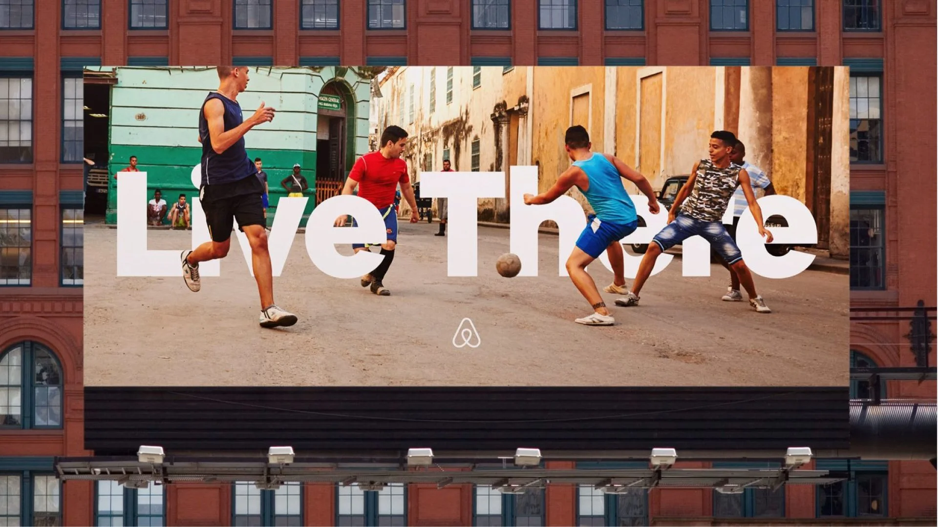
Air BnB Cereal in action.

Netflix Sans with Stranger Things title.

Iittala Aino Typeface by Aleksi Tammi.

Flow Festival typeface by TSTO Studio.
Things to consider when choosing a font for your brand
Regardless of the source, choosing a typeface should involve:
Legibility: Is it readable across all sizes and devices?
Tone: Does it reflect your brand’s voice?
Licensing: Are you allowed to use it across print, web, social, product packaging, etc.?
Language support: Does it cover the scripts and characters you need?
Consistency: Can it scale across various brand applications?
Final thoughts
Typography is often underestimated, but it’s the silent ambassador of your brand. It delivers emotion, clarity, structure, and recognition. Whether you choose a popular Google font or commission a bespoke typeface, the most important thing is to do it with intention. The right font choice is never just aesthetic — it’s strategic.
And if you're not sure where to begin, ask yourself: If your brand had a voice, what would it sound like?
Andree Paat is one of the founders of the Tüpokompanii, estonian fount foundry. He graduated from the Graphic Design department of EKA (EKAGD) in 2016, after which he went on to do an internship at Commercial Type in New York in 2017. Since 2018 he has collaborated on various typeface projects with Dinamo in Berlin, and also operates under the moniker Kirjatehnika.
Mikko Helbma is a founder and manager of Creative Development (CDEV), a development studio with a wide range of client profiles and more than twenty years of experience in web development. CDEV is also our valued development partner, focusing primarily on WordPress.