Famous logos IX — Nintendo
任 (Nin) 天 (ten) 堂 (dō)
Everybody knows Super Mario and Wii, but did you know, that the first game from Nintendo was a set of playing cards?
From the beginning and before expanding out of Japan, the first logo in Kanji (the Japanese writing system) was the three characters ‘任天堂’ spelled as 任 (Nin) 天 (ten) 堂 (dō). Though still debatable, this phrase is commonly interpreted as “Leave fate/luck to heaven.”


Kanji
To this day, this original phrase in Kanji hieroglyphics is used in Japan as the official company name. The name appears on Nintendo’s products for the Japanese markets, although most marketing and communication efforts prominently feature the racetrack logo.
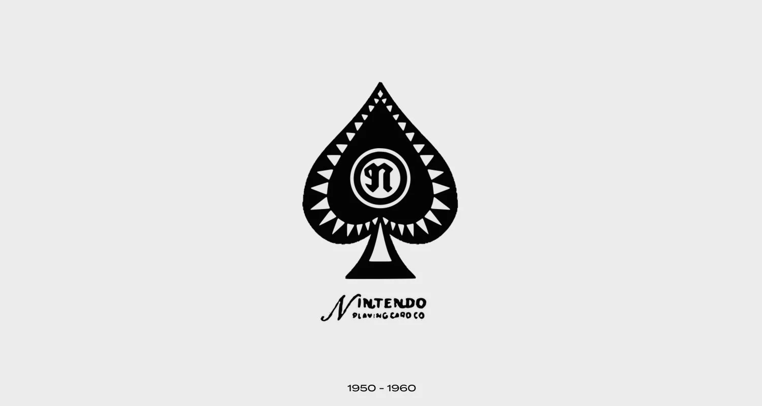
Nintendo Playing Cards Co.
The second brand name contained the English word “NINTENDO PLAYING CARD CO” and the pike symbol. It was the first official logo for the international markets used a flowing script font for the name “Nintendo.”
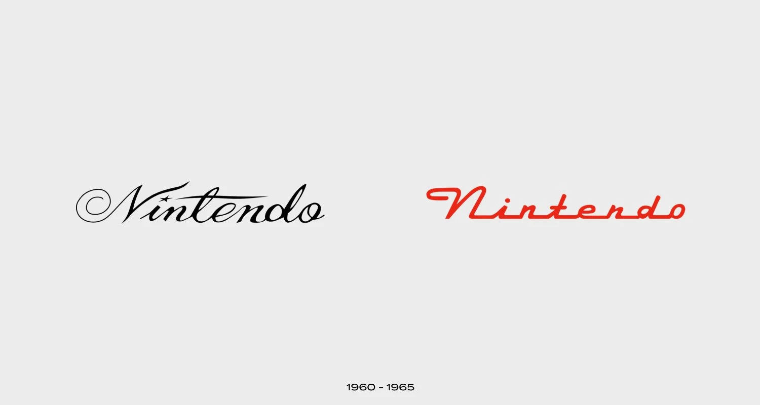
The third emblem is the word “Nintendo” in calligraphic script with a small star instead of a dot above the “i.”
Visual positivity
The Nintendo logo has undergone at least a dozen significant changes, although many of these happened in the 1960s before the company finally found an identity it could settle on. This is not including color scheme changes, which can be difficult to track, given the wide range of colors the brand has experimented with.
As the company tried to find a happy medium for the local and international markets, the designers tried out at least four different fonts, each one different from the previous. It also appears that the company did not favor any particular color scheme, given the random color choices the designers experimented with.

The period of red triangle
Although the brand seemed to have finally settled on a typeface for the logo, the experimentation was still far from over. In 1968, the designers enclosed the wordmark in a hexagon shape of the same color. This enclosure was dropped in 1970 in favor of the familiar rounded square. This version with hieroglyphs was used for only two years.
In 1975, the company decided to drop the rounded square “racetrack” and switched from red to black. This change would last eight years before the company finally went back to the racetrack enclosure, which was made a little bit thicker this time. Interestingly, the racetrack frame is actually the same thickness as the letters, making it an overall well-thought-out look.

1970s - Signs of clarity
1977 Nintendo decided to change it again, the logo was turned white and added a red rectangle frame.
This logo was only used during Shoshinkai 1995 when the console was first introduced to the public.

Black, red and grey
Over the years, the company switched between the color schemes red, black, and grey. The most recent iteration features a red rectangular background, with the letters and racetrack all in white.
A small trademark ® symbol was introduced at the end of the wordmark in 1983. Alongside the font, the racetrack enclosing has become the signature element of the company’s brand style.
In 2016, the company went back to the red and white combination from 1975, except that the colors were reversed. A number of designers have speculated that the color change had to do with the brand’s presentation of their latest product, the Nintendo Switch.

"I like when the plan comes together"
A large part of the company’s success rests on its use of a simple and intelligent design for the logo. Using a straightforward and consistent symbol helps Nintendo remain recognizable and consequently enhances customer loyalty.
Nintendo Symbol: The modern logo is technically neither an image nor a symbol but a wordmark.
The design is quite simple but still striking. The company retains the racetrack enclosure, this time in white, with a red rectangular background. This iteration communicates the company’s chief focus, gaming, instead of serving as a distraction to users.

Switch and Wii
Nintendo Color: Between 2006 and 2016, the company had used a singular grey color scheme, which was yet another switch from the previous red.
In 2016, the company went back to the red and white combination from 1975, except that the colours were reversed. A number of designers have speculated that the color change had to do with the brand’s presentation of their latest product, the Nintendo Switch.

