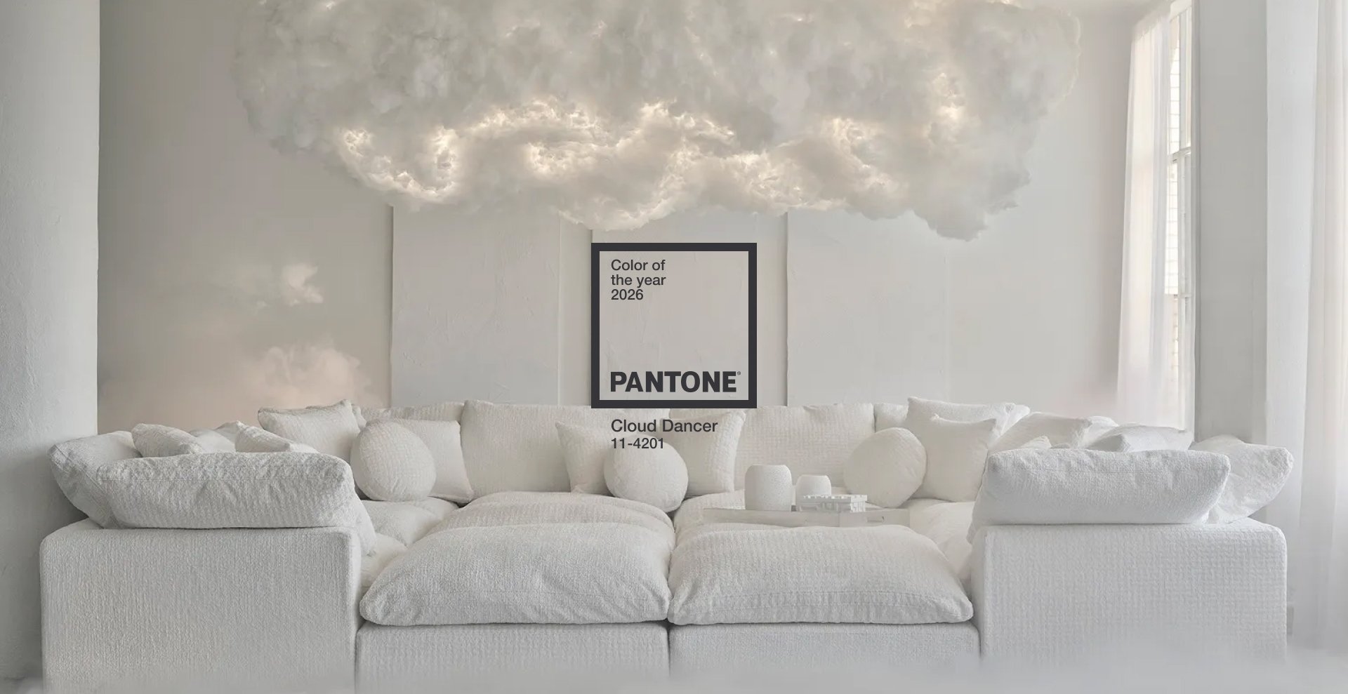
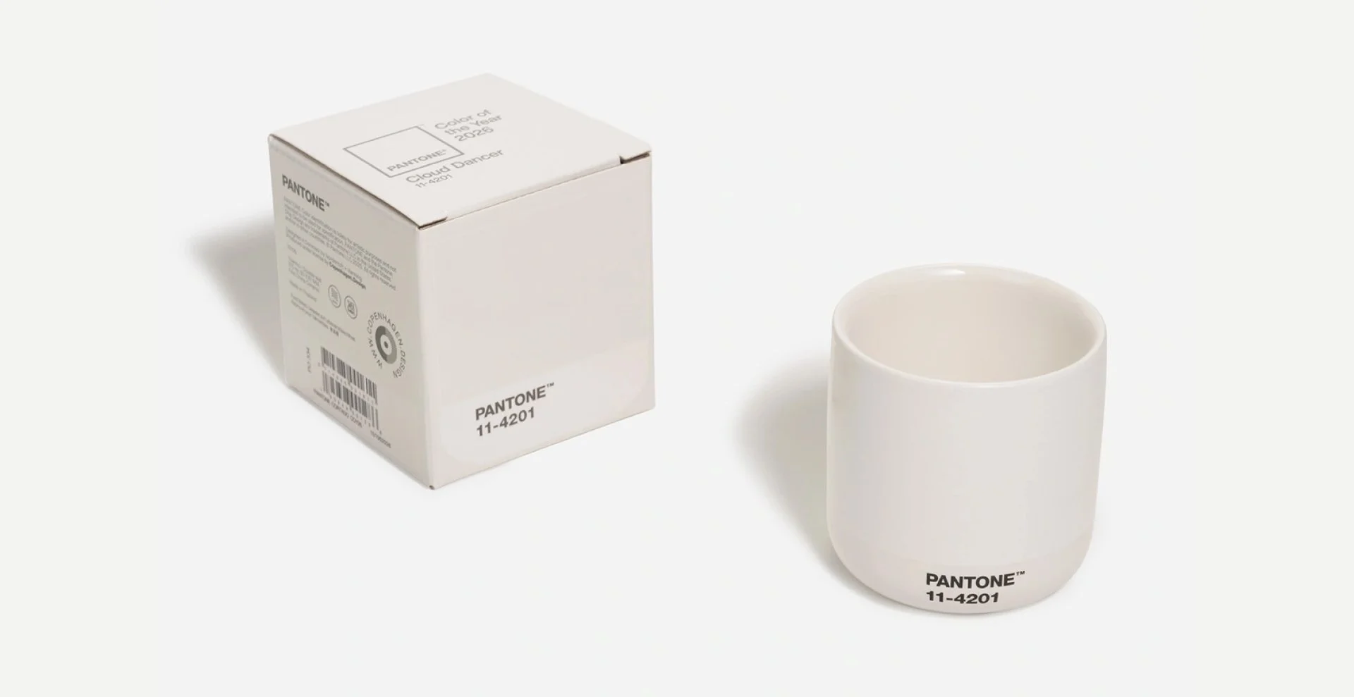
Pantone Color of the Year 2026 — Cloud Dancer
Pantone has announced Cloud Dancer as the Color of the Year 2026 — a tone that combines silence, spaciousness and remarkable clarity. Pantone describes it as a colour that clears the visual field, creates space to breathe and opens room for something new. It is soft and neutral, yet quietly confident.
Cloud Dancer is designed to counterbalance the visual overload dominating today’s world. It does not overpower — instead, it creates space for form, texture, material and colour to stand out.
Why Cloud Dancer?
Pantone notes that the world is oversaturated with information and intensity, and Cloud Dancer offers a calming pause. It is timeless and adaptable, working well with luxurious materials, natural textures, technological surfaces and digital environments. Its soft warmth distinguishes it from sterile white, making it more human and approachable. Pantone emphasises that this is not just a colour but a mindset — a state of clarity.
What does Cloud Dancer look like?
Pantone describes it as “softly nuanced white — clean, calm, uplifting.” Visually, it is a warm white with a subtle natural undertone. It is airy rather than creamy, with a gentle matte glow. It feels calm, balanced and timeless.
Colour values:
RGB 241, 240, 236 — CMYK 0, 0, 2, 5 — HEX F0EEE9 — Pantone 11-4201
Cloud Dancer colour palettes
Pantone presents several palettes demonstrating the tone’s flexibility:
Calm Minimalism — A soft backdrop allowing natural tones and materials to take the lead.
Modern Contrast — Pairs with black, deep grey or saturated tones for bold yet balanced visuals.
Digital Freshness — Suitable for digital environments, adding clarity and calm.
Warm Neutrals — Works beautifully with clay, apricot and terracotta tones for an elegant, timeless feel.
How to use Cloud Dancer?
The tone is highly versatile across fashion, interiors, product design and digital spaces.
• In fashion, it pairs with matte natural fabrics, bringing lightness to layered looks.
• In interiors, it expands space without creating sterility, fitting Scandinavian and Japanese aesthetics.
• In product design, it softens technological surfaces, making products more approachable.
• In cosmetics, it creates a balanced premium effect without excess.
• In UI/UX, it introduces breathing room in information-dense layouts, improving clarity and comfort.
Why now?
In a visually intense world, Cloud Dancer offers a necessary pause. As information load increases and contrasts sharpen, Cloud Dancer provides clarity and space for messages to have impact.
Pantone’s message for 2026: “Return to calm. Let clarity lead.”
How Sviiter Studio interprets it
For us, Cloud Dancer is an essential choice for brands refreshing their visual identity and wanting to reduce visual noise. It gives space to the message, adds warmth and blends minimalist aesthetics with soft neutrality.
Cloud Dancer is not just white — it is a deliberate visual tool that creates contrast without aggression, softness without excess and a visual identity that remains relevant over time.

