Famous Logos XVIII — NASA
Into orbit: NASA and its evolving identity
When we think of iconic logos, few reach the stratospheric recognition of NASA. Founded in 1958, the National Aeronautics and Space Administration quickly became a symbol not just of American innovation, but of humanity's quest to explore the unknown. Its visual identity has evolved alongside its missions, capturing shifts in technology, public sentiment, and even political context.
This July marks the anniversary of the Apollo–Soyuz mission (15 July 1975), the first joint US-Soviet space flight and the first instance the new NASA logo—nicknamed the ‘worm’—was sent into space. This moment made history not just for diplomacy but for design, ushering in a new era in the visual story of space exploration.

The legacy of NACA (1915–1958)
Long before rockets and moon landings captured the world’s imagination, there was NACA — the National Advisory Committee for Aeronautics. Established in 1915, NACA laid the scientific and engineering groundwork for American aeronautics. For over four decades, the agency conducted critical research in aerodynamics, propulsion, and aircraft design. Its identity reflected its technical nature — from its formal serif logotype to its clear, functional communication style.
On 1 October 1958, NACA was officially dissolved, and its staff, research centres, and legacy were absorbed into a newly established organisation: NASA. While NASA’s focus expanded beyond the atmosphere, its roots in aeronautical engineering — and even elements of its communication culture — stemmed directly from the NACA era.
The birth of NASA (1958) — and the “meatball"
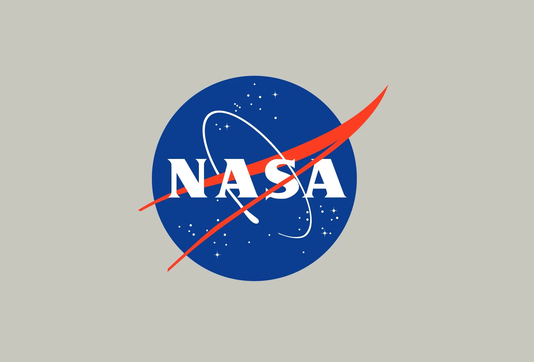
NASA's first official logo, created in 1959 by employee James Modarelli, is affectionately called the ‘meatball.’ It consists of a blue sphere representing a planet, white stars representing space, a red chevron representing aeronautics, and an orbiting spacecraft trail.
Visually complex yet instantly iconic, the meatball reflected the agency’s multifaceted mission in aeronautics and space. It quickly became a fixture on everything from astronaut suits to control room walls, establishing a trustworthy, government-institution image.
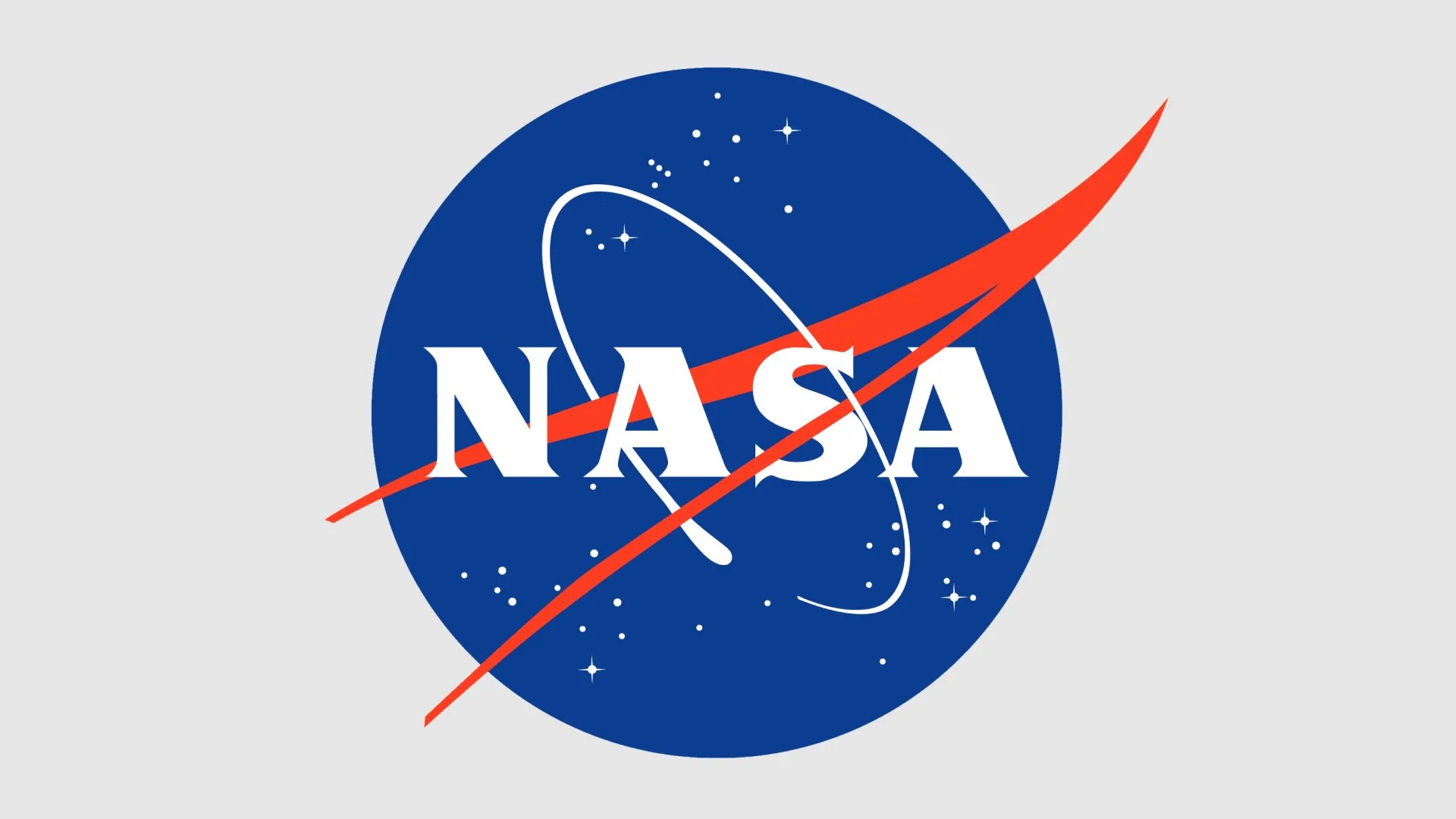
NASA “Meatball” designed by employee James Modarelli in 1959
The 1975 switch — the birth of the “worm”
By the 1970s, NASA wanted a more contemporary and streamlined image. As part of a federal-wide modernisation initiative, designers Richard Danne and Bruce Blackburn were commissioned to reimagine NASA's visual identity.
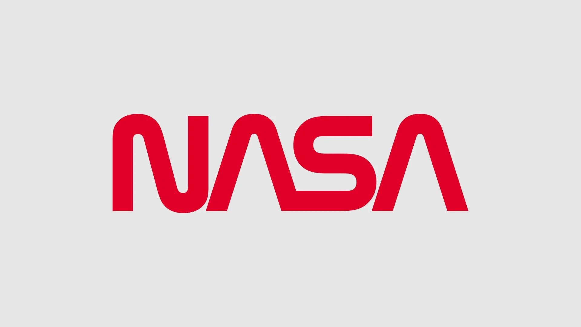
The result was so called a worm logo — a sleek, minimalist wordmark with stylised lettering and no crossbars. First unveiled during the Apollo–Soyuz mission, it stood for modernity, progress, and clarity. The clean, bold aesthetic embodied the optimistic outlook of late-20th-century American design. The NASA "worm" logo, a stylized red "NASA" logotype, was designed by Richard Danne and Bruce Blackburn in 1974. It served as NASA's official logo from 1975 to 1992, and was revived for limited use in 2020. The logo was part of the Federal Design Improvement Program, which aimed to update graphic design across federal agencies.
Danne and Blackburn, founders of the design firm Danne & Blackburn, created the logo as a more modern alternative to the existing "meatball" insignia. The worm logo was designed with a sense of modernity, progress, and propulsion, and the "A"s in the logo were intended to resemble rocket nozzles.
Since, NASA “worm”logo is still partly used the visual identity guidebook (Graphic Standards Manual) from 1976 is still in use and publicly available.
Back to the ‘meatball’ (1992) — tradition returns
Despite its modern appeal, the worm had its critics. In 1992, NASA administrator Daniel Goldin reinstated the original meatball design, arguing it better captured the agency’s heritage. The worm was retired, but not forgotten. Over time, it developed a cult following among designers and space enthusiasts alike.
In 2020, with renewed public interest in space travel and NASA’s collaboration with SpaceX, the worm logo was brought back — not to replace the meatball, but to live alongside it. The dual identity reflects a new chapter for NASA: one that honours the past while embracing the future.
The Crew Dragon Demo-2 mission launched with the worm logo visible on astronaut suits and rockets, reigniting affection for the 1975 design. Today, both logos serve NASA in different contexts, offering versatility and nods to different generations.
NASA's famous 'worm' logo crawls back into action on SpaceX rocket — space.com
Beyond logos: NASA's extended visual language
NASA's identity extends far beyond its logos. Typography plays a critical role, with numerous fonts inspired by NASA’s minimalist aesthetic—including NASALization, Space Mono, and others. A consistent colour palette of deep blue, white, black, and red provides a visual cohesion that amplifies trust and clarity.
NASA's branding is often considered a masterclass in balancing government formality with mass cultural appeal. The logos appear on mission patches, technical documents, and fashion collaborations alike.
In addition to the insignia, NASA has another official symbol. If the meatball is the everyday face of NASA, the NASA seal is the dressed-up version. The NASA administrator uses the seal for formal purposes such as award presentations and ceremonies. Like the meatball insignia, the seal also includes planet, stars, orbit and vector elements.

NASA also uses symbols for specific projects within the agency. Each space shuttle crew designs a patch that represents what it will do during the mission. Some robotic probes sent to explore space have had mission patches.

Legacy and cultural influence
Both the meatball and worm logos have transcended their government origins. They now appear in films, fashion, music videos, and streetwear—from H\&M to Alpha Industries and Heron Preston. NASA has become more than a space agency; it’s a symbol of curiosity, science, and the limitless human spirit.
As NASA looks ahead to lunar missions and potential human exploration of Mars, its logos continue to serve as emblems of ambition and wonder.
“A logo is not communication. It’s identification.” — Bruce Blackburn
The worm or the meatball, both are visual artefacts of humanity’s greatest adventure.
Besides main visual identity NASA have a set of Mission human space flight mission patches for Mercury, Gemini, Apollo, Skylab, Space Shuttle programs and Commercial Crew Programs. The whole list features a collection of 174 mission patches printed in full-colour.

Mission human space flight mission patches for Mercury, Gemini, Apollo, Skylab, Space Shuttle programs and Commercial Crew Programs.