Famous Logos XXI — Spotify
When Spotify launched in Sweden in 2006, it became more than a streaming platform — it became a cultural phenomenon that reshaped how people discover, listen and relate to music.
Spotify is a strong example of a brand that grew from a simple idea — making music easily and legally accessible — into a complete ecosystem where sound, technology and design merge into one seamless experience.
The evolution of the logo
Spotify’s first logo in 2006 was more playful than refined: a green oval with stylised sound waves and a casual wordmark. It reflected its era — early Web 2.0, when digital products were colourful, friendly and full of personality.
A significant shift took place in 2013. The oval was removed and only the three curved lines inside a circle remained — a simplified icon that later became known as the Spotify Spot.
During the same refinement, the logo became monochrome, the green grew bolder and the whole visual identity was unified under one clear primary colour and a simplified wordmark. This was the moment Spotify found its visual confidence — as solid as the role it had already established in global music culture.
The version used today is nearly identical to the 2015 update: timeless, scalable and unmistakably digital. It works equally well on screens, buttons and campaign visuals.

Spotify Green
Spotify’s signature brand colour — Spotify Green — is one of the most recognisable colours in digital branding.
During the 2015 redesign, the platform moved from a softer green tone to a bright, almost neon shade. The result was a colour that stood out clearly from its competition — not blue like Apple Music, not monochrome and premium like Tidal, not warm orange like SoundCloud — but something more energetic, optimistic and human.
The colour expresses rhythm and movement. Traditionally, green symbolises growth and new beginnings — but for Spotify it represents freedom: the freedom to explore, listen and create.

Spotify Green — Pantone 3542C - HEX #00CE7C - R30-G215-B96 - C80-M0-Y80-K0
Spotify Black — HEX#121212 - R18-G18-B18 - C73-M67-Y68-K82

Spotify Green vs UI Green — when a colour must function
Spotify Green isn’t just part of the brand — it is the brand. But as accessibility expectations evolved, colour contrast became critical.
Instead of changing the primary colour, Spotify created a darker variant called UI Green, designed specifically to meet accessibility standards and increase legibility in the interface.
For years, Spotify used bright green buttons on light backgrounds — until the design team reached an unavoidable realisation:
A colour loses its meaning if it cannot be read.
By switching to darker backgrounds, the original green achieved a contrast ratio of 10.9:1, meeting WCAG AAA standards.
This approach shows a modern branding truth: a brand must evolve with its environment — without losing its identity.

Spotify UI with UI Green buttons. Source Spotify.design
Typography and iconography
Spotify uses the typeface Circular, created by Lineto. Its geometric rhythm, softened by rounded forms, communicates clarity, friendliness and confidence.
The pairing of the wordmark and the icon is intentionally minimal — all unnecessary elements have been removed, making the identity flexible across campaign visuals, UI and motion.
In recent years, Spotify’s visual system has become increasingly expressive — gradients, animation and audio-responsive elements now support the brand language. Spotify is no longer a static brand — it is a moving identity.

Circular typeface by Lineto. Source Lineto.

Spotify’s visual language. Source Spotify.design
Spotify Wrapped — when design becomes ritual
Since 2016, every December Spotify users receive a personalised listening summary — a digital moment that merges data with personality, nostalgia and visual storytelling.
Spotify Wrapped is not a report — it is an experience.
It transforms numbers into emotion, behaviour into personality and music history into identity.
Its cultural impact has been so significant that platforms like Apple Music (Replay) and YouTube (Recap) have attempted to replicate the idea — yet none have achieved the same emotional momentum.
Wrapped has become more than a feature — it is a yearly global tradition.
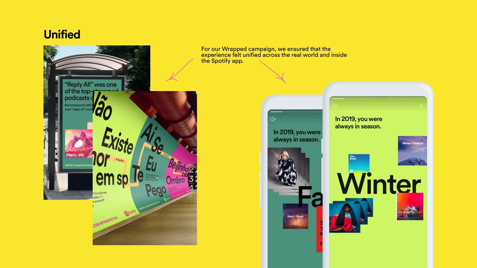
Spotify Wrapped campaign. Source: Spotify.design
Differentiation and sound identity
Spotify’s visual story and sonic language work together. The three curved lines reference sound, movement and rhythm — visually and conceptually.
Where Apple Music positions itself as exclusive and minimal, and Tidal leans into premium monochrome aesthetics, Spotify is intentionally accessible — informal, warm and human-centred.
A similar design principle — a bold highlight colour combined with a dark base for clarity and hierarchy — was also applied in our visual identity work for Leanest.

Leanest visual identity by Sviiter Studio
What brands can learn
Spotify’s power isn’t only in its logo or colour — it lives in consistency, evolution and cultural timing.
A logo today is no longer static — it is a living element within a continuously developing design system.
Spotify shows how a brand becomes recognisable not only through shape and colour, but through experience, behaviour and emotional meaning.
It remains one of the clearest examples of modern branding where simplicity, rhythm and personality form the framework of the identity.