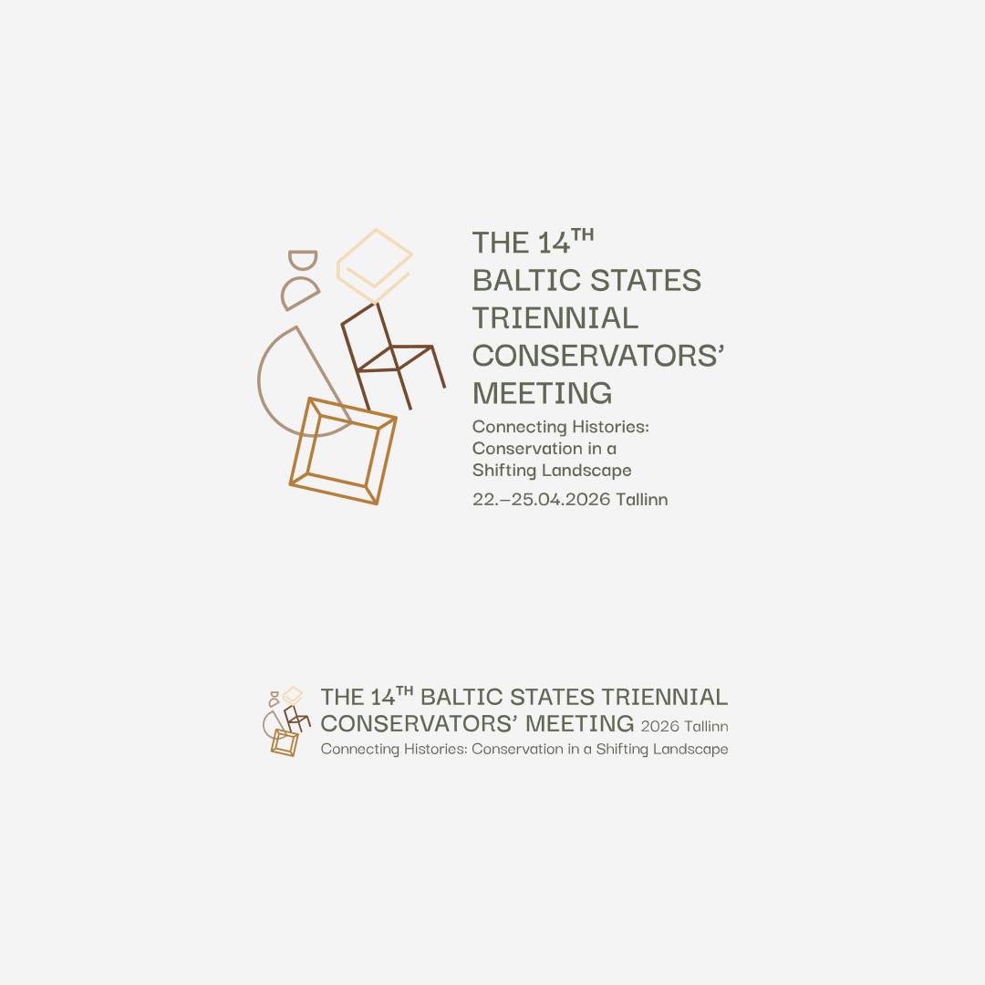
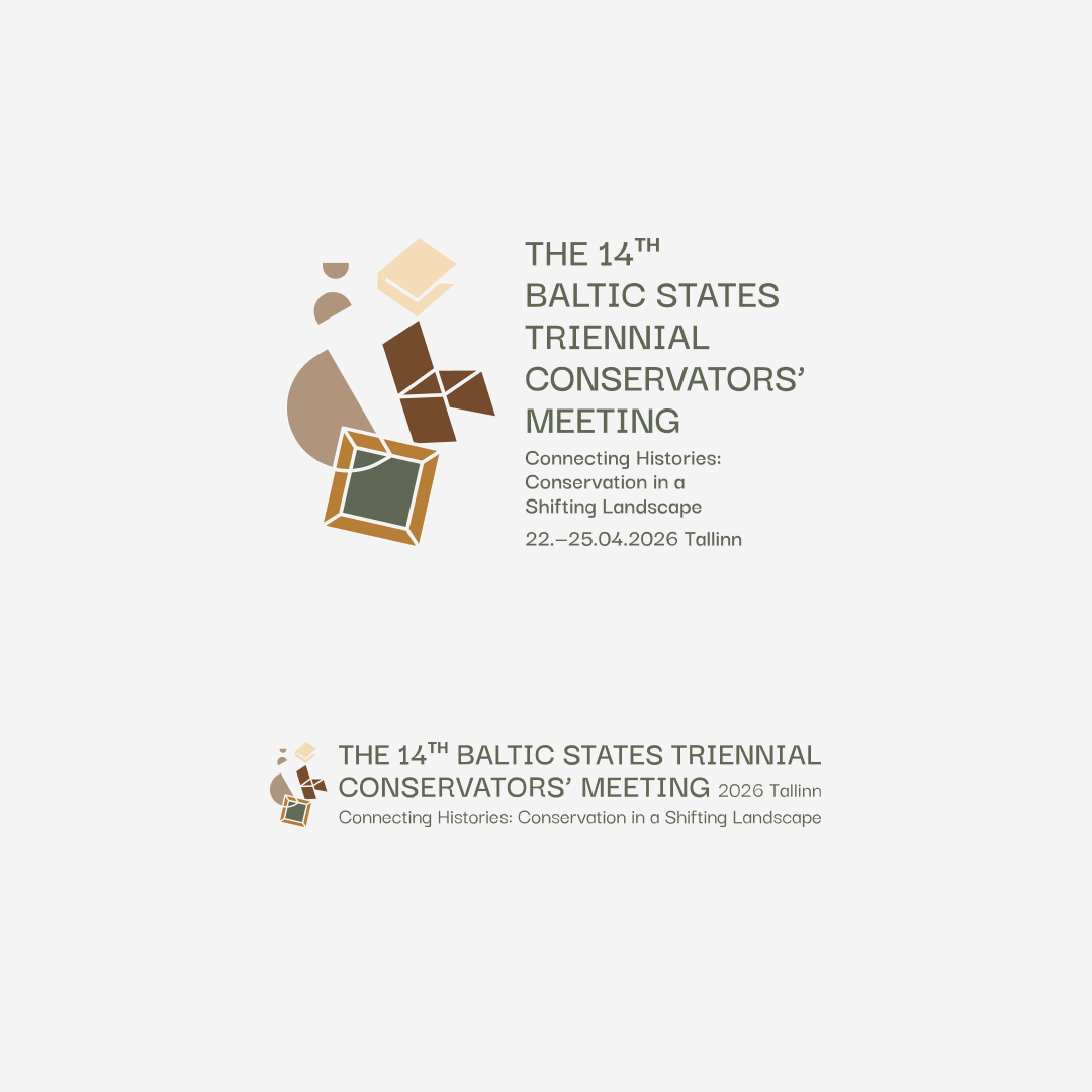
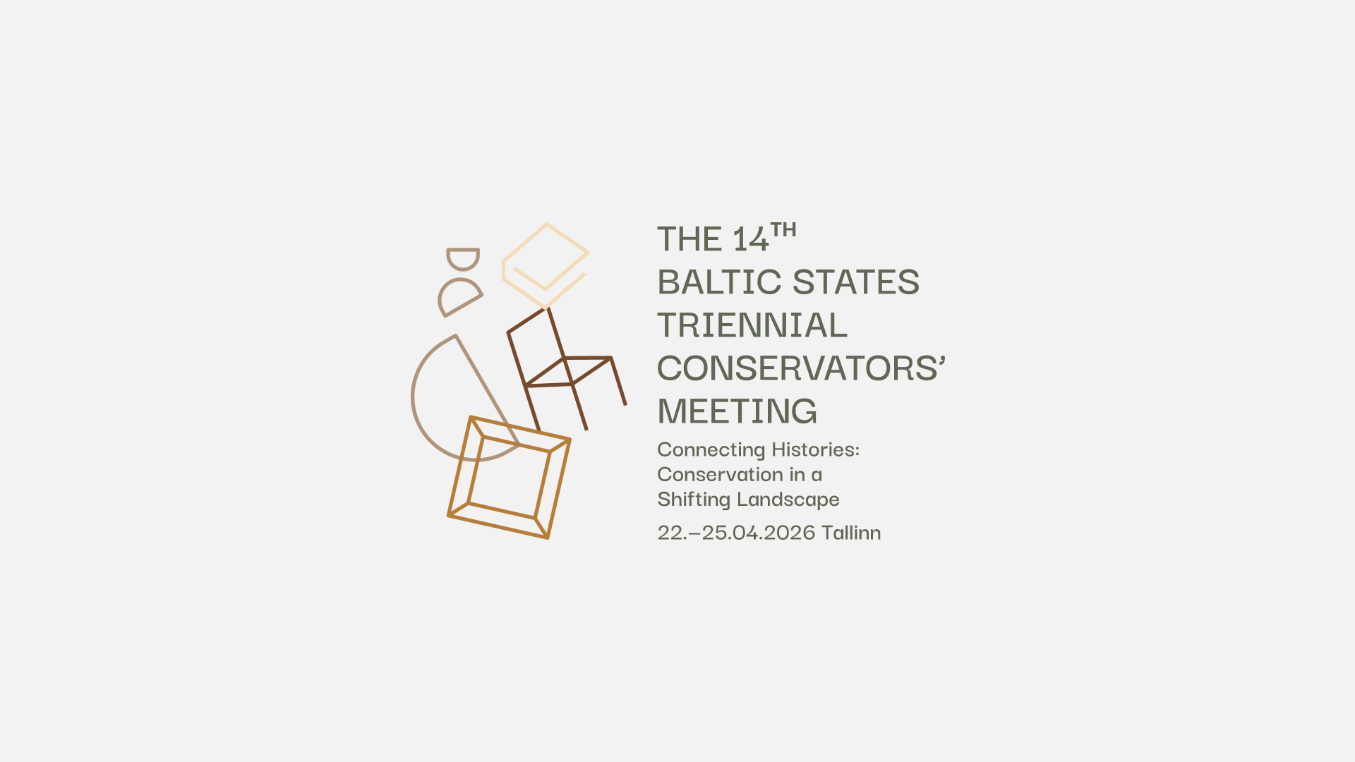
14th Baltic States Triennial Conservators’ Meeting
The 14th Baltic States Triennial Conservators’ Meeting, organised by Eesti Konservaatorite Ühing, will take place in Tallinn from 22–25 April 2026. The event gathers conservation and heritage professionals from the Baltic region to explore the theme “Connecting Histories: Conservation in a Shifting Landscape.”
The Society of Estonian Conservators
2025-2026
A full visual identity designed to reflect heritage, materiality and the spirit of preservation
The identity is designed to adapt seamlessly across formats and scales — from printed programmes and posters to digital presence and presentations. The modular icons and colours offer flexibility, while maintaining an overall cohesive visual voice that matches the conference’s mission and audience.
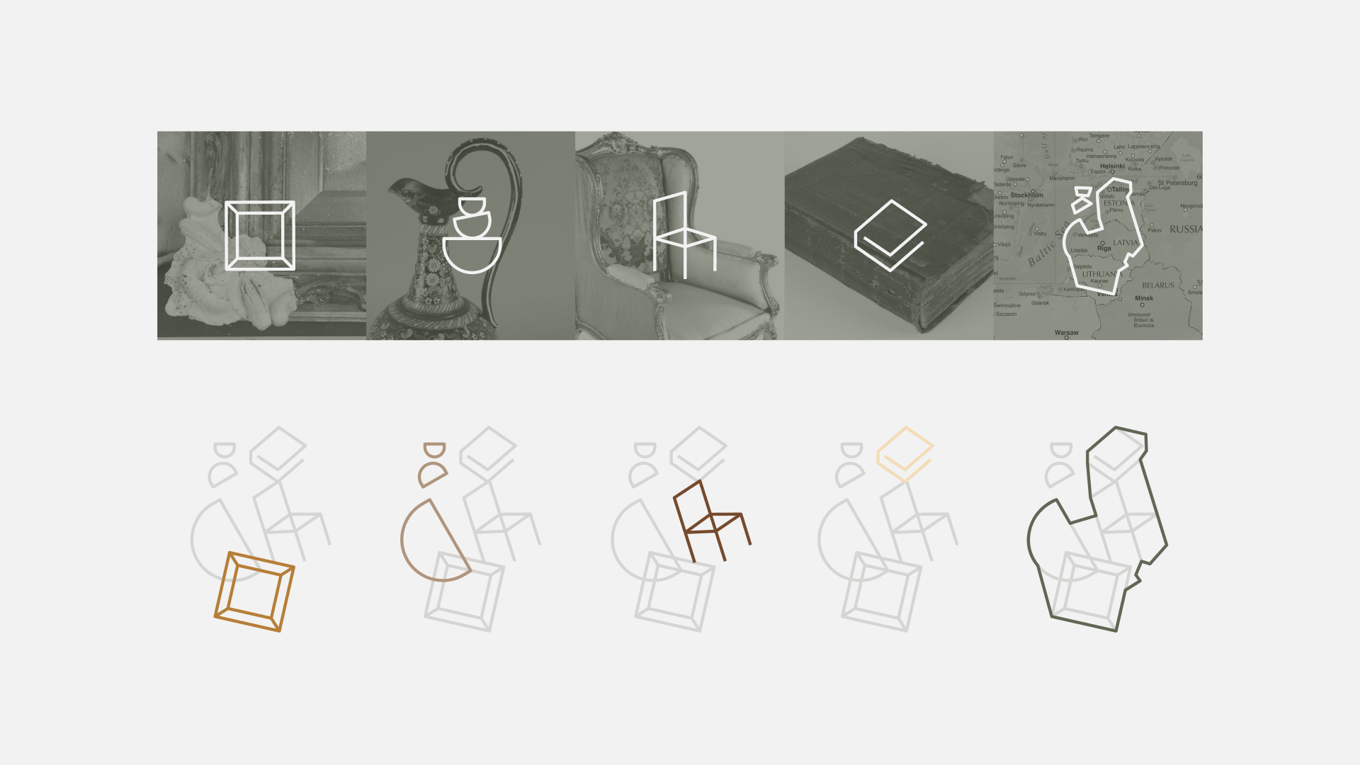
Concept and visual language
Inspired by the tangible heritage of furniture, ceramics, books and crafted artefacts, the visual identity uses abstracted geometric forms suggestive of frames, chairs, ceramics and books. These shapes evoke layered histories, material tactility and the ongoing work of conservators — bridging past and present. The modular system allows versatile application across print and digital media, from conference materials and programmes to signage and social assets.
Typography
We adopted Darker Grotesque for its contemporary neutrality and readability. Its clean geometry combined with subtle humanistic touches supports clarity across applications — from detailed academic material to event signage — all while preserving a refined, professional feel.

The selected colours draw on the aged surfaces, materials and textures familiar to restoration work. They create a subdued, cohesive palette — calm yet rich with connotation
-
Porcelain Beige adds warmth and soft neutrality. Inspired by aged ceramics, plaster surfaces and hand-finished glazing, it introduces a refined, human presence within the system. Its gentle tone acts as a subtle bridge between digital clarity and physical craftsmanship, making it an ideal supporting tone in layouts where information, texture and space must coexist.
-
Dusty Gold introduces a muted metallic warmth without leaning into excessive shine or luxury. It draws inspiration from gilded frames, decorative metalwork and the subtle sheen of materials that have aged gracefully. The colour brings contrast and recognition to key graphical elements, enhancing visibility while maintaining the identity’s understated character.
-
Landscape Green forms the base tone of the palette — grounded, restrained and reminiscent of archival textiles, oxidised bronze and historic patinated surfaces. It evokes both outdoor heritage environments and the quiet stillness of museum storage rooms. As a background or structural colour, it creates a sense of depth and stability, supporting content without overwhelming it.
-
Parchment White is the lightest tone in the palette — soft, off-white and reminiscent of historic documents, aged paper or preserved manuscripts. It avoids the sterility of pure white and instead supports a visual atmosphere rooted in authenticity and time. As a background tone, it provides clarity, readability and a gentle archival neutrality.
-
Wood Brown represents tactility and the character of time — echoing furniture, carved ornaments and historic timber structures. It carries visual weight and narrative memory, referencing surfaces that have been handled, repaired and preserved. Used intentionally and sparingly, it creates visual anchors within compositions, guiding the hierarchy and emphasising detail.