Summary of the 2020
2020 was difficult, instructive, challenging, but also gave us a lot of positive to move forward.
Identity
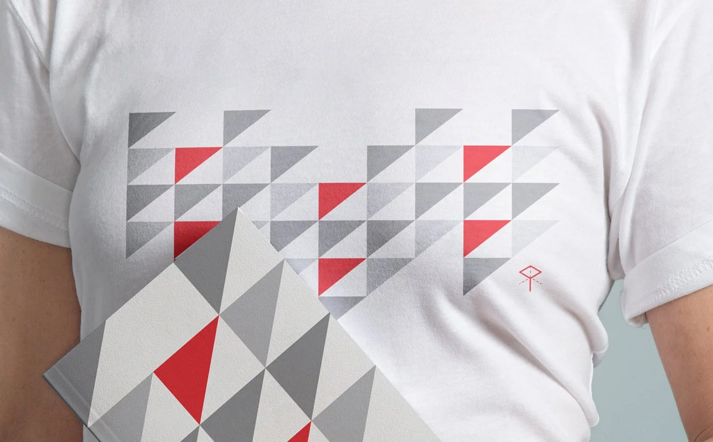
PNL Insenerid - The brand refreshment for small engineering bureau was one of the coolest challenges in the second half of the year. We updated visual language, corrected the use of the logo, created triangular patter imitating the city silhouette and architecture in general, which also was printed with velvet textile into hoodies and went to team Christmas presents. Read more

Bon Soya - Coolest Estonia vegan producer, Bon started to renew its visual language at the beginning of the year, as a result of which we cleaned up the existing visual language, modernised the overall look, brought in supporting colour scheme, clear typography and graphic elements. Read more

Estonian Ministry of Climate - Now, when that working at home and remotely is sometimes a new norm, the Ministry of Climate gave us a task to visualise the fields of their internal communication, which subjects and messages they contain. Read more
Tallinn University's project Future School - Visual communication set the tone quite strongly this year, here too. Program received a badge and visual communication tools to identify themselves more clearly and visually as a whole. The visual supports the Tallinn University style book using the same colors and typography.

Riigi Kinnisvara Podcast ja Webinars - Another project to increase communication. The podcast is aimed at improving the internal communication of a large organization, the webinars bring together in-house experts who introduce the activities and expertise of Riigi Kinnisvara to cooperation partners, other field specialists and people in related fields. Read more
Printing
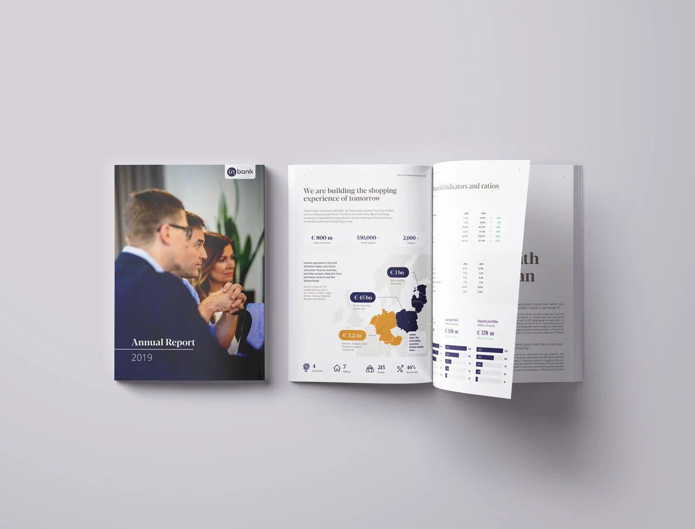
Inbank 2019 annual report - Cooperation with one of the fastest growing Estonian banks continued this year as well, in the summer we completed their 2019 annual report, to highlight something, we processed a load of data and implemented the new visual language at the same time.
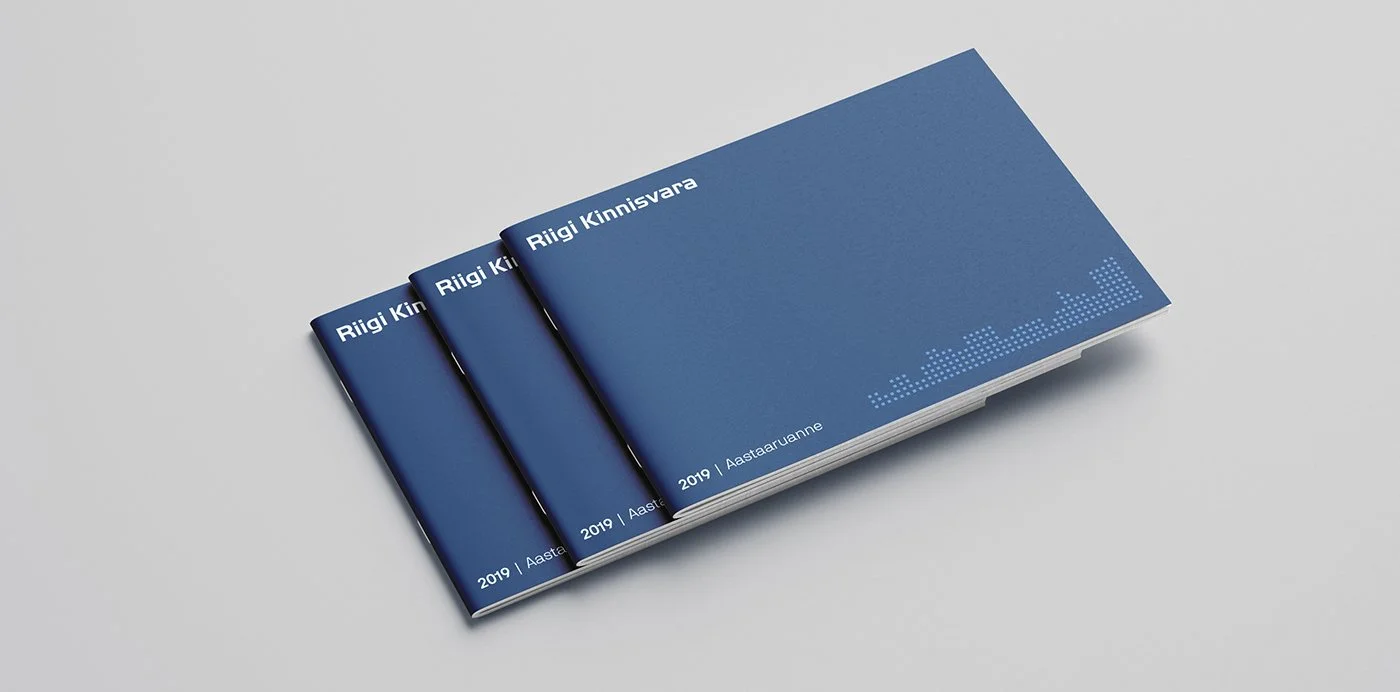
Riigi Kinnisvara 2019 annual report - The second big annual report we made this year. Loads of awesome pictures, infographics and pleasant overviews of construction projects completed in 2019 in the public sector.

Wesse catalog update - We created the previous catalog in 2016, and although it had received minimal changes in the meantime, this year's update was a bigger venture - The logic of the layout was updated and we added many wonderful projects. Go to the new Tallinn showroom and ask a copy for yourself! Read more
Websites

ESC Global Security - In fact, an earlier project that finally saw the light of day this year. A solid and sophisticated corporate website for the delicate security and safety sector.

Luxveg and Luminor - During the first wave of Covid-19, Luminor organised a competition for entrepreneurs to support their first steps in selling good online. We were in the role of mentor and visual enhancer in this project. Together with Voog, we created an online store for Luxveg, where they could easily sell their products and manage the sales process.
Package
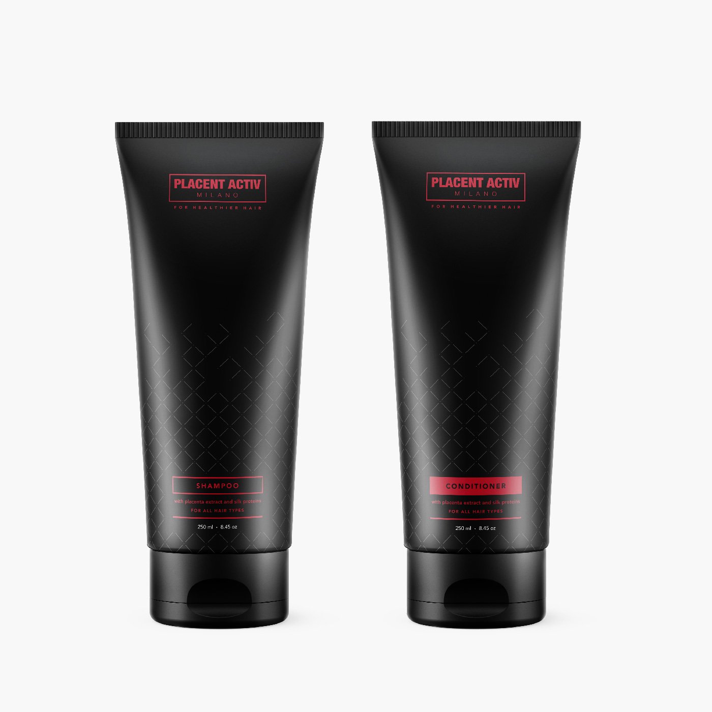
Placent Activ Milano - In 2019, we launched the first version of Placent's online store, and it's cool to see how their sales numbers have gained up. Investments into the new channel have led to an increase in orders, and the readiness before the first wave of the virus gave them the opportunity to be in the picture even when our world was closed. This year we have renewed Placent's product lineup. Their existing products were shampoo, conditioner, vitamins and hair serum.
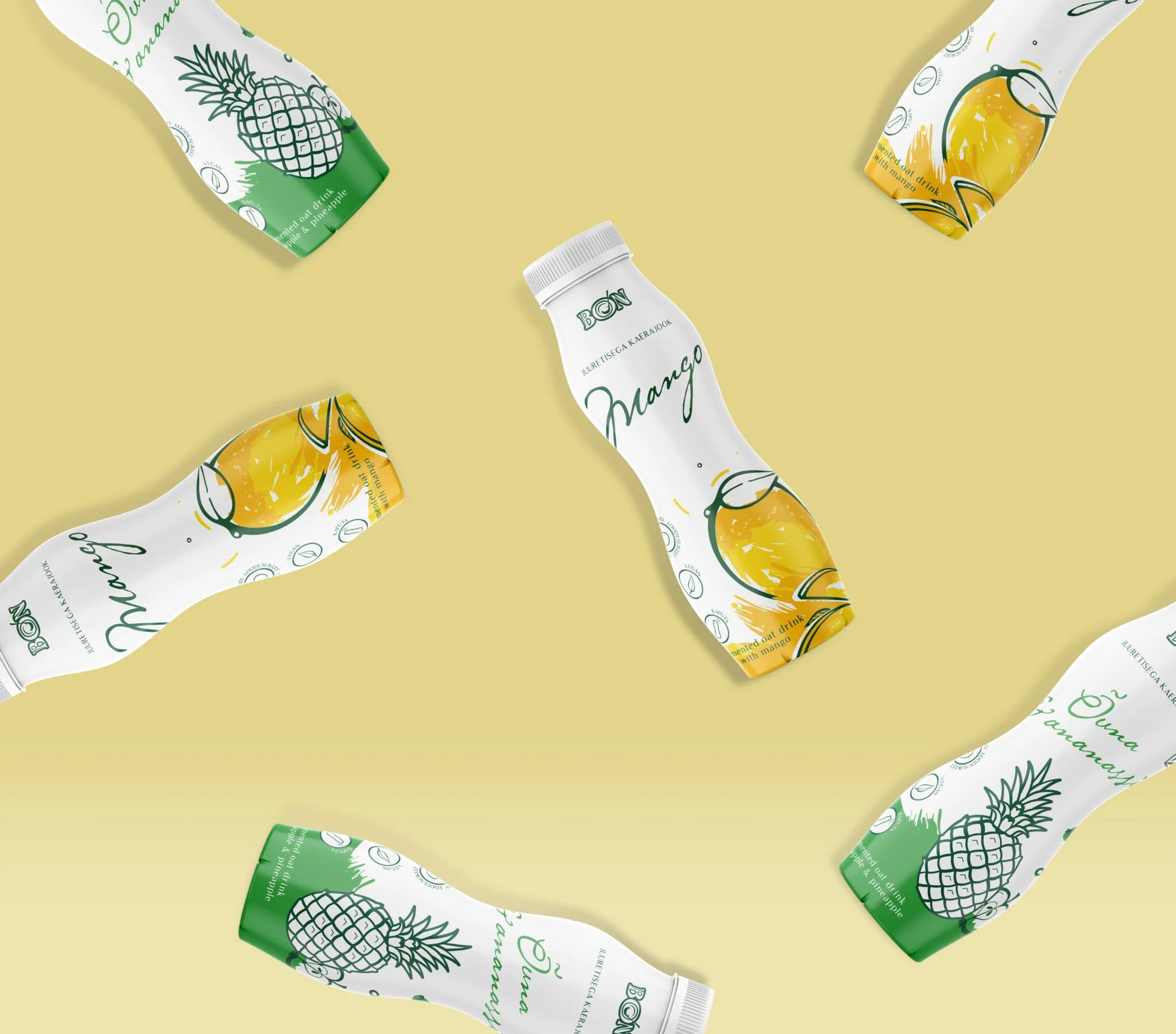
Bon Soya - Besides brand update what you read before, we were honoured to create packaging for Bon's new product line for both the leavened oat drink series and oat desserts. In addition to the cool visual language, these products are simply delicious. We recommend you find them in larger grocery stores. Read more
Campaign
Softrend - a campaign to express the comfort of being at home and yourself comfortably. The campaign visual, created vith blending product photography and graphic characters and it carries these values nicely, leaving the product in the main focus , while creating a pleasant atmosphere around the classic product image.

Estonian Design Center visited us and Bynew - on January 16, another meeting of the network of Estonian design network took place. This time there were two organizers - Sviiter and Bynew. It was a pleasant and moody evening, which was made while the danger was far away. Maybe we can improve it in the soon-to-be-started 2021.
That's what it was like, different jobs and activities. See you in 2021.