Famous logos XVII — Switzerland
The power of Swiss branding — a visual identity with global recognition
Switzerland is one of the few countries that has successfully built a strong and cohesive national visual identity. While many nations have flags and symbols that evoke their heritage, Switzerland took this a step further, creating a branding system that is instantly recognisable worldwide. The red-and-white colour scheme and the Swiss cross are more than just national symbols — they are hallmarks of quality, precision, and reliability. Unlike most other countries, Switzerland’s approach to a national identity was a deliberate effort, formalised in the mid-20th century. The Swiss Federal Council played a role in standardising the use of the Swiss cross, and designers from the renowned Swiss school of graphic design helped shape the country's visual narrative.
Switzerland’s main logotype by MADE Identity
The Swiss cross — a symbol of trust and excellence
The Swiss cross is arguably one of the most recognisable national symbols in the world. While it originates from the country’s military history, it has grown into a mark of excellence across industries. From Swiss watches to pharmaceuticals, finance, and even chocolate, the cross signifies precision and high-quality craftsmanship. Companies such as Victorinox, Swiss International Air Lines, and Swatch integrate the cross directly into their logos, reinforcing the strong connection between their products and the Swiss brand identity. This conscious integration of national identity into corporate branding is a unique phenomenon that few other nations have achieved to the same degree.
Brand description by MADE Identity, the author of the Switzerland’s new identity.
“‘Our Nature Energises You’. This promise is at the heart of the brand and is also made visible in its appearance. While breathtaking nature is conveyed through images, ‘Energise’ finds a home in the colour palette. The Swiss red fans out into a five-stage colour palette that recalls the alpine glow in our mountains. The colour palette becomes a noticeable brand asset that invigorates the brand in many ways through motion. Using the colour edge as a layout element, the colour palette becomes a connecting constant across all applications throughout the brand universe.”
Helvetica, and others — the typefaces that shaped global design
Switzerland is a country with influential fonts and type designers. Max Miedinger, Adrian Frutiger, Bruno Maag (Dalton Maag). A country that is already a worldwide sensation in terms of design. Swiss tourism has always put this quality boldly in the spotlight for its marketing. In the spirit of this tradition and its effectiveness, they developed a custom font for the Switzerland brand together with the Geneva-based type foundry Extraset and also local branding agency MADE Identity to develop new and fresh look for Switzerland Tourism.
No discussion about Swiss branding would be complete without mentioning Helvetica (based on ‘Helvetia’, the Latin word for ‘Switzerland’), one of the most influential typefaces in history. Designed in 1957 by Max Miedinger and Eduard Hoffmann at the Haas Type Foundry, Helvetica was created to be neutral, legible, and highly versatile. Its clean, modern lines made it a favourite among designers, and it quickly became a staple in corporate branding.
In 1959, Mike Parker was appointed director of the Mergenthaler Linotype Company, an American firm that sold Linotype typewriters, the first machines to automatically assemble rows of characters. Parker was given the task of expanding the font library owned by the company, and between 1959 and 1981 he managed to add almost 1,000, in many cases adapting pre-existing fonts to suit the technical demands of the Linotype machines.
In 1960, Parker decided to adopt Neue Haas Grotesk, and asked Arthur Ritzel, a designer from D. Stempel AG – a German firm that worked in partnership with the Lynotype Company (now owned by Monotype) – to redesign and develop the family of fonts. This new font was renamed Helvetica.

Max Miedinger with his Helvetica
The font instantly became an icon of Swiss design, which at the time was seen to epitomise understated elegance and functionality, and throughout the 1960s and 1970s it appeared on numerous advertising posters and billboards across Europe and the USA.
Over the decades, Helvetica has been used in some of the most iconic logos in the world, including those of Lufthansa, American Airlines (before its 2013 rebranding), Panasonic, and Nestlé. Its widespread adoption is a testament to Swiss design principles — functionality, clarity, and timelessness. Helvetica is more than just a font; it embodies the Swiss approach to design, where simplicity meets effectiveness.
The Swiss government’s adoption of Helvetica as an official typeface appears to have occurred over time, with significant developments in the early 2000s. In 2004, the Swiss federal administration initiated a move towards a standardized corporate identity, aiming to unify the diverse logos and graphic styles of its numerous departments. This initiative led to the adoption of a common logo featuring the Swiss cross and standardized typography. Interestingly, despite Helvetica’s Swiss origins, the font chosen for this standardized identity was Arial, primarily due to cost considerations, as Arial was readily available and did not incur additional licensing fees.
By December 2008, the Swiss government’s Corporate Identity Manual specified the use of Helvetica Neue 75 Bold for the wordmark in the basic version of the Swiss logo, indicating a formal adoption of Helvetica in the country’s official visual identity. While Helvetica has been emblematic of Swiss design since its creation, its official incorporation into the Swiss government’s visual identity seems to have been solidified in the early 21st century, particularly with the 2008 corporate design guidelines.
Visual Identity samples by MADE Identity, photo by Organisator.
How Swiss brands reinforce the national identity
Swiss companies have successfully leveraged national branding elements to strengthen their own identities. Many Swiss brands incorporate the Swiss cross, red-and-white colour scheme, or Helvetica typeface into their logos. For example Victorinox — Known for Swiss Army knives, the company prominently features the Swiss cross in its emblem, instantly associating the brand with reliability and precision. Swiss International Air Lines — The airline integrates the national flag into its branding, reinforcing the idea of Swiss quality and hospitality. Swatch — The Swiss watch brand’s logo includes the Swiss cross, underlining its origins and commitment to excellence. Or even Swissdent, who offers really high quality premium mouth-care solutions world-wide.
The connection between the national brand and corporate brands helps maintain Switzerland’s reputation as a country that produces world-class products.

Sample of Swiss Airlines campaign poster
A national identity that drives exports
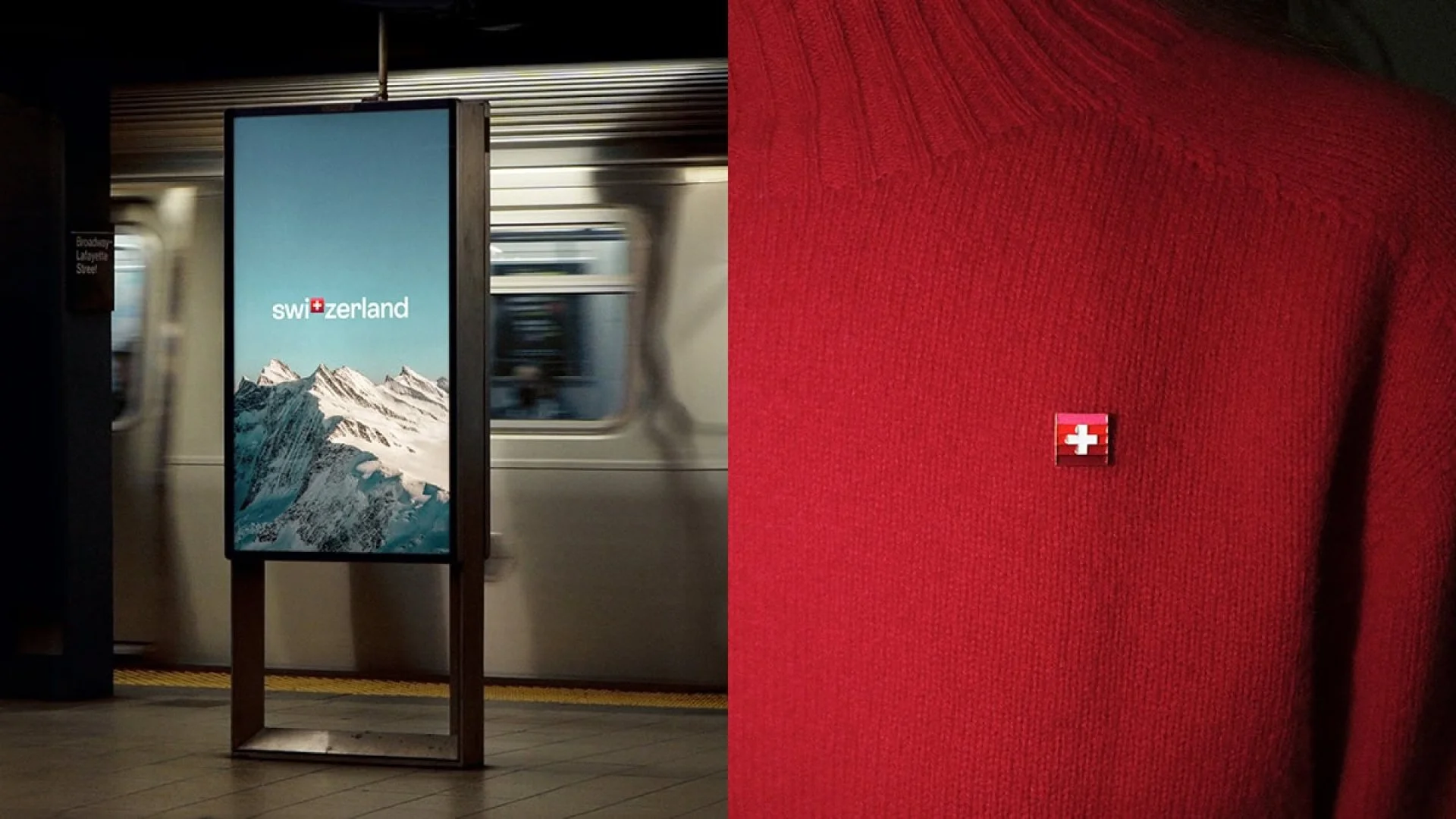
In 2022, Switzerland Tourism underwent a significant rebranding initiative led by the Zurich-based agency MADE Identity. This comprehensive redesign aimed to modernize the organization’s visual identity and included the introduction of a custom typeface named ST Allegra. Developed in collaboration with the Geneva-based type foundry Extraset, ST Allegra was designed to embody clarity and approachability. MADE Identity describes it as a “font that smiles and welcomes you,” reflecting Switzerland’s renowned hospitality.
The rebranding also introduced a new logo that cleverly integrates the Swiss cross into the word “Switzerland,” replacing the letter “T.” This design choice emphasizes national pride and aligns with the organization’s goal of creating a unified and versatile brand ecosystem. The previous logo, known as the “golden flower,” had been in use since 1995, and the update was seen as a necessary step to reflect contemporary design sensibilities and the country’s dynamic tourism offerings.
This strategic shift in visual identity underscores Switzerland Tourism’s commitment to presenting a modern and inviting image to the world, leveraging design elements that resonate with both tradition and innovation.
The strength of Switzerland’s visual identity extends beyond aesthetics — it has real economic value. The "Swiss made" label carries immense weight in global markets, influencing consumer perception and driving exports. Whether it’s luxury watches, pharmaceuticals, financial services, or high-precision engineering, the association with Swiss quality adds a premium to products. The country’s branding strategy has turned its national identity into a globally recognised mark of trust, benefiting both businesses and the economy.

Swissdent packaging, photo by Swissdent
The power of a cohesive visual identity
Switzerland’s national branding is a masterclass in consistency and strategic design. Through deliberate visual choices — from the Swiss cross and colour scheme to Helvetica’s widespread use — Switzerland has built a strong and enduring identity. The success of Swiss branding proves that a well-crafted national visual identity can extend far beyond government institutions, influencing industries and shaping consumer trust on a global scale. The Swiss model stands as an inspiration for other nations and brands looking to build a legacy through design.