Famous logos XX — Otl Aicher
The designer who gave systems a voice
Early life and education
Otl Aicher was born in Ulm, Germany, in 1922. Growing up in a politically turbulent time, he refused to join the Hitler Youth and even spent part of his youth in hiding. After the war, he studied sculpture and design at the Academy of Fine Arts in Munich, but his most important contribution would come not from his formal education but from his vision of design as a tool to rebuild and reimagine society.
Together with his wife Inge Scholl and Max Bill, he co-founded the Hochschule für Gestaltung Ulm (HfG Ulm) in 1953. This design school was considered the spiritual successor of the Bauhaus, placing equal emphasis on social responsibility, aesthetics, and functionalist rigor. It became one of the most influential design institutions of the post-war period and shaped a new generation of designers.

Otl Aicher observing printed layout of the Rotis typeface letter a.
The Munich 1972 Olympics — a new visual language for the Games
One of Aicher’s most famous achievements came when he was appointed design lead for the 1972 Munich Olympic Games. His task was monumental: create a complete identity for an event with a global audience, overcoming the shadow of the 1936 Berlin Olympics that had been marred by Nazi propaganda.
Aicher introduced a bright, optimistic colour palette based on the “rainbow” system — avoiding red and black due to their associations with militarism and aggression. He created a coherent visual system across signage, printed matter, uniforms, and venues. Most notably, he developed a set of pictograms representing every sport and service. These pictograms were designed with clarity and universality in mind, allowing visitors from any country to navigate and understand without language barriers.
His work set the standard for future Olympic Games and inspired wayfinding systems worldwide. The 1972 Games are still remembered as a triumph of design thinking applied on a massive scale.


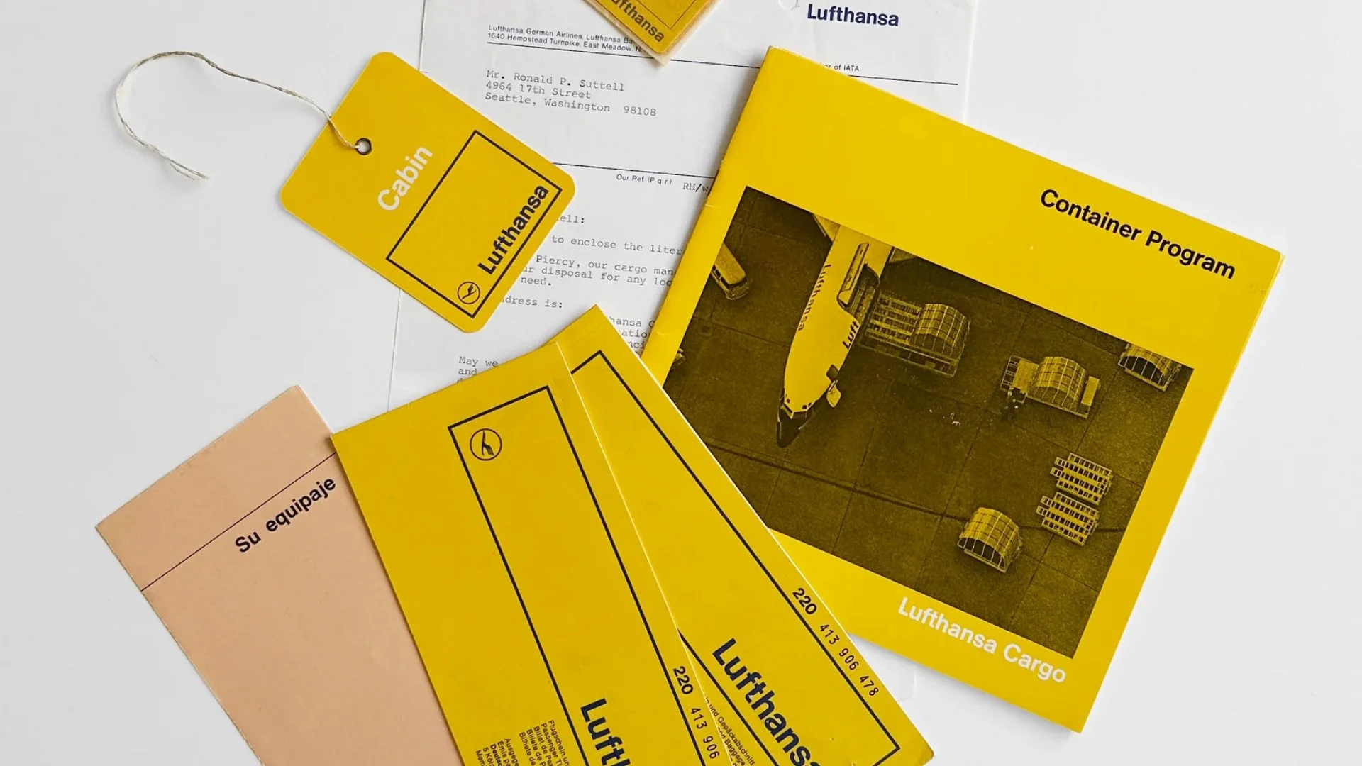
Lufthansa (1969) — flying into the modern age
During the 1960s, while teaching at Ulm, Aicher began to receive large-scale corporate commissions. One of the most defining was Lufthansa’s corporate identity.
Although the Lufthansa crane logo was originally designed by Otto Firle in 1918, by the 1960s the airline needed a cohesive visual system that reflected Germany’s new, modern face after WWII. Aicher led the redesign, introducing a geometric refinement of the crane and placing it inside a bold circle. He paired this with a typographic system based on Helvetica, which gave the brand clarity, neutrality, and timelessness.
This project came at a crucial stage in his career — establishing him as a leader in corporate design systems, not just graphics. The Lufthansa identity remains one of the most enduring examples of applied modernism.

ERCO and Braun — design as a dialogue with industry
Aicher’s work extended beyond identity into broader corporate design systems. With ERCO, a German lighting company, he developed a complete design programme that unified graphic design, architecture, and product communication. His clean layouts and focus on modularity gave ERCO a strong, forward-looking presence.
Similarly, Aicher worked with Braun, a company already closely tied to Dieter Rams’ industrial design philosophy. Aicher’s visual design translated Rams’ “less but better” approach into corporate communications. This created one of the strongest examples of synergy between product design and graphic identity in the 20th century.

Otl Aicher played with different weights of Univers in the ERCO logo (E–R–C), but in order to achieve perfect balance, he hand-drawn the final letter O — hence the note “gezeichnet”, meaning “drawn” in German.
The Rotis typeface was created by Aicher in the 1980s, named after his place of residence (Rotis im Allgäu). It has been widely used across his projects, fitting seamlessly into visual identities, posters, signage, and the broader public space.
Why were the first three letters of the ERCO logo set in Univers? At the time, Univers was one of the most prominent typefaces, widely adopted by many designers. Aicher himself used it extensively, for example in creating the Lufthansa logo that we have also highlighted in this series.

HfG Ulm — the Bauhaus legacy reborn
Perhaps Aicher’s deepest impact was through his role as co-founder and professor at HfG Ulm. The school emphasised systems thinking, interdisciplinarity, and the role of design in shaping society. Unlike the Bauhaus, which focused heavily on craft and art, Ulm prioritised semiotics, sociology, and information theory.
From this approach came a new kind of designer — not just an artist, but a problem solver who could address communication, usability, and branding in a systematic way. The influence of HfG Ulm is still felt in today’s design education, especially in how we think about corporate identity as a system rather than just a logo.

Selection of Otl Aicher posters — from left: Romanticism as a Spiritual Event (1957); Reconstruction (1947); Europe 79, Election Poster for the European Elections (1978–79); vh ulm Programme, Poster for vh ulm (1948–49).
Philosophy — design as a social responsibility
For Aicher, design was never just about making something attractive. He believed design had a moral dimension — a responsibility to make the world clearer, fairer, and more accessible. He resisted the idea of design as pure marketing, insisting instead that it must serve society.
This worldview shaped every project he undertook: from the human-centred clarity of the Olympic pictograms, to the disciplined precision of Lufthansa, to the educational framework of Ulm. Aicher taught that design could (and should) make life more understandable.
As he once said:

Otl Aicher’s work remains a cornerstone of modern visual identity. He showed that logos are not isolated marks but part of systems that must work across scales, mediums, and cultures. His designs are timeless not only for their aesthetics but for the thought behind them.
Today, his influence is visible in every major sporting event’s identity, in the continued strength of Lufthansa’s branding, and in the design education models that prioritise clarity and social responsibility. Aicher proved that design is not just about selling — it is about building trust, order, and meaning.